Wednesday, 20 April 2011

TYPE MATTERS!

A few weeks ago, my tutor John invited me to attend a lecture that was being given to another of the university's courses about Typography. I wasn't told who was speaking, or the purpose of the lecture, but was intrigued to discover more especially as my current project was type-based.

(Images courtesy of Creative Review)

I soon discovered that the session was being given by Jim Williams, a lecturer from Staffordshire University, who is an advocate of good type design. He is also a member of the prestigious New York Type directors club, and has been awarded with many notable design awards. Recently, Jim has completed a small booklet titled "Type Matters!" (a more detailed book format is due to be released next year), which highlights the importance of correct type usage and the common mistakes people, particularly designers, can make when designing with type. It's a lovely little publication, really nicely designed, however not widely available (you have to contact Jim and pay a small fee of £5 to purchase a copy).


Jim's talk was really helpful and interesting. He ran through the main elements of type usage that are often used incorrectly or misunderstood, including sizing, column width, hyphenation and widows and orphans. I've discovered personally, that these elements can be so easily overlooked so it was great to have this refreshed in my mind for when I came back to my projects. 

Jim also talked us through some of his favourite and most influential type designers. These included some of my favourites also, such as Herb Lubalin, El Lissitzky, Jan Tschichold and Fabien Baron as well as many I wasn't as familar with. These included John McConnell, Gene Frederico and Otto Storch, who have all produced some really beautiful type-based design and definitely work that I will refer back to again further on in my studies.

John McConnell

Otto Storch

Gene Frederico

Jim explained that, although his book focuses mainly on type from printed formats, it doesn't have to just be a 2D representation on screen. Designers such as Sagmeister have used more crafted techniques to produce their type pieces. This was really significant for me, as I'd really been struggling to produce more experimental type work; I was too focussed and concerned with producing it digitally, which as I soon discovered is not my strong point. 

I really enjoyed Jim's talk, he was clearly passionate about everything that he did, including teaching the students at Staffordshire Uni. He showed us some of the work they had produced in response to an experimental format brief. The pieces varied from large-scale A0 sized books to books encased in perspex and moulded into shapes. They were really beautiful and incredibly imaginative, and I was highly impressed with the amount of creative skill his students presented. A fascinating session.

Monday, 11 April 2011

Graphic Design and the Dotted Line, Russell Hancock

Lecture and Portfolio Discussion.


Russell Hancock is a freelance graphic designer, who came to talk to us about his experiences in the industry, but more importantly about what to expect / how to set up as a freelance designer when leaving university. I was really interested to hear what he had to say about this, as so far this is an area we haven't yet covered while on the course.

Before becoming a freelance designer, Russell worked in a collective called "Soup" that he set up with friends from university. They gained a series of small-name clients, which gained him experience, but his most influential work was the publication they produced for free titled "From Carn to Cove". It was this that gained Russell more work. Although the majority of the work Soup created was small-scale and for free, Russell told us to be very wary of clients expecting free work. Although good "for exposure" this is often just a way of taking advantage of your skills for free.

After a while at home, Russell gained a job at Empire design agency, who create many of the movie posters that we see advertising films today, but sadly lost out to a permanent position there (much to his disgust) and then worked for ASHA (Arthur Steen Horne Adamson) where he found it to be a bit of a pyramid-shaped business and his opinion didn't matter. Despite this, he got to work on some brilliant projects and gained a lot more experience.

Russell's biggest job to date however, happened a lot out of luck - he saw that his local old art-deco cinema was becoming more and more dilapidated, so he wanted to improve it, and try to get the owners to re-open it. He and a friend helped to decorate the exterior of the building for free and he produced a petition to open up the cinema again. The cinema was bought by a new owner and is in the process of being renovated and restored. The owners also have plans to create a franchise, and now Russell has the opportunity to create the branding for a whole series of cinemas.

In terms of freelance, Russell gave us a lot of really helpful hints:

- Get money upfront and a signature
- Be sure of your opinions, but rememeber... it is just an opinion
- Demand respect, but all in all keep learning
- Assess free work carefull
- Act professionally
- Remember people, and be remembered
- Sometimes clients are bad(!)
- Don't be afraid to talk about payments / salary
- Be organised
- Digital portfolios are a MUST

These may seem like common sense, but can be so easily overlooked, so it was really helpful to have someone drill them into us.

I also spent some time talking through my work and portfolio with Russell, which was really helpful. He gave us even more tips on how to create and present a successful portfolio, be it in paper or digital format. I was really pleased that when talking through mine he was very impressed with what I had to show. My portfolio has always been one of those "hazy" areas, where I've never been too sure how to present my work best. I've had quite a lot of contradicting opinions on it so far, mostly less positive from my tutors because they want me to push my presentation further, yet a lot more positive responses from others. I'm a little bit confused at the moment, but I think I want to develop it more as it is a little... generic. Here is an example:


The Value of Design, MDS. 23/3/2011

Forgive me, once again I am incredibly behind on my blog entries!


There was a lot of buzz about the Manchester Design Symposium on various social networking sites and forums, which got me really excited to find out more about the event. Unfortunately though, I wasn't able to purchase a ticket, so when I discovered that my university course would be holding a "lucky dip" competition to win one, I leapt at the chance and was very pleased when I discovered I had won one.

Organised by Design Initiative, in partnership with Independent Northern Creatives, Manchester City Council and Manchester Metropolitan University, the symposium focussed on a central theme throughout the day – ‘The Value of Design’. Many speakers were to participate in the symposium, Si Scott (Si Scott Studio), John Walters (Eye Magazine), Bruno Maag (Dalton Maag), Jonathan Barnbrook (Barnbrook) and Tom Dorresteijn (Studio Dunbar). With such an exciting mix of speakers, I couldn't wait for the day to begin.

"Bee" part of Si Scott's "Airborn" illustration series.


Professor David Crow (Dean of MMU and designer/writer) opened the symposium, and introduced Si Scott, a UK based artist / designer who primarily works with hand-drawn typography and illustration. I felt a little bit sorry for Si, as he seemed a little overwhelmed by the size of the audience (most likely down the fact he was on strong pain-killers for a back injury) but he gave us a great insight into the work that he does. He has such a laid back attitude about what he does, and spent a lot of his session talking down about the work he creates (which is a shame seeing as it is all so beautiful) but he was interesting and his talk was thoroughly enjoyable.  Si gave us insight into the value of originality and his annoyance towards those who try to imitate his very distinctive style - "the whole idea of my work, is that it is my work" he explained. He also described how he dislikes using computers to produce his work. "I'm rubbish at it," computers are too fast for him, and he finds that they have the ability to dilute design too much. Si prefers to be spontaneous, and doesn't like to plan ahead with his ideas - which often causes problems with clients who like to see the development of ideas. Si has even walked out on prospective clients because they wanted to restrict his personal style. A really interesting talk.


Second to talk was John Walters from Eye magazine. A writer, editor and publisher, John isn't necessarily a designer but has always been involved with it. John explained how we should value design in 5 ways: editorially, culturally, functionally, financially and educationally. "There's more to design than just following a brief" - as a graphic design student, I couldn't agree more with this response! John talked us through some of his favourite covers, articles and interviews from eye magazine, which was fascinating.

Current issue (79) of Eye magazine

Next up was Bruno Maag of Dalton Maag, who specialise in type and identity design. For Bruno (and many) type is the fundamental element of design, and fonts are some of the most valuable assets a designer can make use of. I found his talk so interesting, as I am currently developing my own typeface and it is a process that is somewhat overwhelming. "All you need is some black and white gouache," explain Maag, "technology is not a necessity". This was a useful tip - when working on my own designs after the symposium, I closed my laptop and just used a paintbrush and ink. It allowed me to create more interesting free-hand characters than I would have been able to produce using computer software. Bruno talked through Dalton Maag's "Ubuntu project", an open source system that offers free applications and software to the community. Dalton Naag developed a 13 style typeface in order to speak to all of Ubuntu's customers, an example of how fonts can give value to the community.

Example of Dalton Maag's Ubuntu typeface


Jonathan Barnbrook gave a fascinating, and often hilarious, talk about the value of fonts. His talk was structured under various different topics, all of which he linked back to the work that he and Barnbrook and Virus fonts creates. The topics were as follows:

1. A better society through more rational typeforms (in which he talked about his first font, Utopia and one of his more controversial typefaces, Prozac).
2. Appropriate forms for new technology (his font Bastard was created as a response to "legible" commercial letterforms, Barnbrook wanted to created the most illegible, legible font)
3. Appropriate forms from new technology (Shock and Awe was created based on the type found on the side of tomahawk bombs, and Stealth was created from Stealth bomber letterforms)
4. Appropriate forms for new language (Nixon was a typeface to tell lies with, Drone is for text without content)
5. Appropriate forms for showing the parameters of language (Tourette - based on swearing but not aggressive in aesthetics. Expletive, also based on swearing but has the charm of someone who wouldn't)
6. Subverting existing forms to tell a new truth (Olypukes; olympic pictograms changed to represent the more negative side of the event)
7. Creating and utlising beauty to understand the past (Exocet and Infidel, both based upon historical scriptures and lettering).

Again, discovering more about the type designs Barnbrook creates was really helpful for me and my own typeface explorations. Barnbrook's talk really aided me in my research, especially as he is quite experimental and controversial in his approach. A really great talk.

Section of Barbrook's "Expletive" typeface.


Last but not least was Tom Dorresteijn, from Studio Dumbar based in Holland. Tom's views of the value of design, or the "design of value" often linked back to the ability of turning people on; how design should touch the emotional channel of people. As well as taking though some of Studio Dumbar's work, his talk was filled with a lot of very thought provoking statements and pieces of advice, for instance he explained how we "shouldn't try to become someone else, but become who we are. Try to enrich what you do with the broader horizons of design. If you don't you will limit yourself". It was a really insightful talk, especially for those of us in the audience who were students about to embark on careers in the industry.


Dutch Chamber Choir from Studio Dumbar on Vimeo.


Wednesday, 30 March 2011

"Computers are a great way of making shit faster"

Brian Cannon, of Microdot, came to talk to us the other week. I was already aware of Microdot's work, so was quite excited to discover more about what they do. Working predominantly in record label / sleeve design, Microdot was set up in 1990 by Brian. He explained how, from an early age, he knew that he wanted to enter the creative industry, and this was encouraged by his father - a coal miner with a taste for art. As Brian grew up, he found himself becoming more and more influenced by music such as The Sex Pistols and their iconic artwork produced by Jamie Reid.

Brian is an advocate of non-computer-based design work. Brian favours working with hand-made collages and photoshoots, which he prepares for weeks in advance, believing the image is king. With this in mind, Brian prefers to use small and simple type when producing his artwork, for he feels too much can interfere with the narrative of the imagery. He was also influenced by the symbolic paintings of Jan van Eyk, which further encouraged him to incorporate more of a narrative in his work. A good example of this is the artwork he produced for Oasis'  Definitely Maybe album. Each of the elements featured in the image were strategically positioned and planned in advance in order to form meaning. Brian also showed us a practice image that was taken weeks prior to the actual photo shoot, featuring himself laid on the floor in the position that Liam was later to take for the official shot.


Brian was a really enthusiastic speaker, and had a clear passion for the work that he does. It was really inspiring to see how far he had come in his career. He admitted to his "big-break" involving himself and Liam Gallagher (from Oasis) in a lift, during which Liam complimented him on his shoe-choice. Soon a relationship with the band had been formed and Brian was to create the majority of their albums' artwork. I questioned Brian on whether he felt he would be doing the same job if he hadn't had that break. "Most definitely," he replied "this is what I always wanted to do, I'd have got there somehow or another but I was just very lucky that day". This determination and pride was really refreshing to hear, as so often we have lectures from people who seem to have become a little too complacent about the work and status that they have achieved. Brian works to the best of his ability even if he isn't keen on the actual project - which is a valuable behaviour to pick up, as I find myself becoming very unmotivated if I don't enjoy the brief I've been set. I guess you have to make it your own though, and it is clear to see this is exactly what he has done. Brilliant.

osa/ MERZEN/

Recently around Manchester, there has been a festival showcasing exhibitions and happenings the have been inspired by Kurt Schwitters. Titled MERZMAN, the festival explores the artist's legacy in modern architecture and contemporary art practice. A month or so ago, I went to view Ingo Gerken's exhibition at Castlefield Gallery as part of the festival, which if I am honest I was completely disappointed by. With this in mind I really wasn't sure what to expect but wanted to experience Cube's event with an open mind.

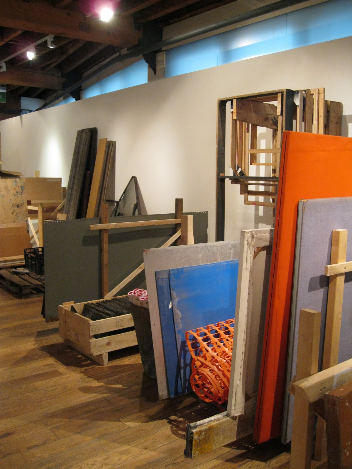
It was an odd set up - at first I wasn't sure whether I had entered the correct room, as it was filled with planks of wood, old doors, scraps of building materials - and even a broken litter bin - which was curious to see in a gallery space to say the least. It looked like a junk site, however we were soon given a run-down of what the show was about, and there was a lot more material to read which helped explain the idea behind the show. This was already an improvement on the previous Castlefield exhibition, as previously we hadn't been given any explanation of what we were supposed to be viewing. 


osa's installation was a representation of Schwitters' well-known collage technique, which he called Merz. The artist invited the public of Manchester to bring along any found or unwanted items that could be contributed to the installation (hence the "junk" we discovered on entering the building). The idea was to transform the gallery in order to blur the border between existing space and installation, or frame and content. This is exactly what Schwitters' was exploring in his collages - one of which was featured as part of the exhibition. His work has been really highly regarded by me for a very long time and it was amazing to see it on display as I have yet been able to do so. His collages are so intricate and visually stimulating. I loved the fragments of old type and stamps the most.


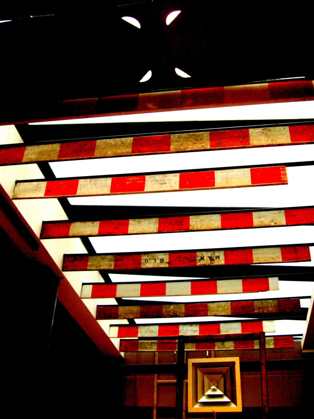
The exhibition set up, allowed me to view these random fragments of Manchester in a different light; plastic construction fencing cast vivid shadows on the wall and the orange colour contrasted beautifully to some planks of wood that had been hung next to it. Roadwork barriers held from the ceiling formed layers against the gallery's fan. I began taking photographs of what I saw, which themselves became installation collages. Here are some of my favourite snapshots:


I thought this was a much better representation of the Schwitters legacy. It was interactive, dynamic and really made you view the somewhat mundane elements in a different way; a sort of beautiful context displacement.

Flashback: Anish Kapoor

Once again I have slipped behind on writing my blog up, so not only does Flashback signify the name of this exhibition, but it also refers to the fact that I visited it nearly 3 weeks ago now, oops.

I've been aware of Anish Kapoor for a long time now, in fact I'm pretty certain I first discovered what he was about back during my AS Level Art studies, but this was the first time I was to witness his work in person. If I am completely honest, I wasn't sure what to expect. This was probably due to my rather limited knowledge of what he does, but on entering the exhibition I was very pleasantly surprised.

Kapoor's 'Flashback' exhibition is currently being held at Manchester Art Gallery by the Arts Council Collection, and comprised of sculptures from different stages of his career. The pieces ranged from early sculptures made using pigment, to later works employing stone and mirrored surfaces, to works that engage directly with the surrounding architecture. It was this last element that I think impressed me most, particularly his piece "When I am Pregnant" (1992). From afar, it seemed as though the wall at the far end of the gallery space had some sort of eerie shadowy shape projected onto it, but as you came closer you realised that it in fact formed a rather large and protrusive bump extending from the wall's surface. It was very surreal but fascinating, and really played tricks on your perceptions of the room and its dimensions.


The whole space had a strange sense of calm, I found myself staring into the works and becoming almost lost in what I was viewing. I was also really taken in by another of his works, titled "Her Blood" (1998). These 3 curved mirrored plates distorted the reflected images that varied depending on how close you stood to them, rather like a more beautiful and dynamic hall of mirrors. I spent a lot of time trying to discover the surface of the plates; one of them was stained red, but it was really difficult to see how they had been created. I liked this fact though, it all added to the mystery of the experience.


I left the gallery feeling quite overwhelmed - in a good way. It was a really beautiful collection of work, and a very relaxing experience.

Tuesday, 22 March 2011

ready to bind

So the book, or "visual journal", I have been slaving over for the past week is finally ready to be completed. It will be perfect bound with a hardback cover, fingers crossed all goes well once I'm in the book-binding studio.


Tuesday, 8 March 2011

Visual Journal


Diving against vivid woodlands looks static. Time is the image of unchanged motion. 


Marina sat in the library then discovered the future message: approach changes confidently and create desire. Rigid graphic images took over and vanity was there. Reflections across chaos built revolution and hand-written rebellion was ablaze. 


Nature celebrated a hidden underground environment. The end is nothing was whispered The final plan was once credible but can it be trusted? 


Personal texts and numbers are metaphors and ahead of the times. Ghost towns, troubles and the sound of the rejected were being discovered.


Focus was on reason but stayed lack-luster. Fear captured imagination as dystopia took control. Sounds, texture and information is all based on assumptions from a select audience.

April beauty holds eye and the direction. Moving can change communication but optophobia will influence.

Mutant propaganda orders a clear structured movement to promote change.

The boundaries of seeing bleed with the spirit of perspective. Poetic translation touches the subverted and creates pixies that enjoy the horror.

Maps do not exist above the water but directions are clear.


*NB: This is a visual journal of my time during my third year at MMU. Not all of the imagery used in the collages is from my own work. Some are representations/small sections of other work that I have viewed/been influenced by while on my Design and Art Direction course. I will gladly remove them if this causes issues. Each piece used will be referenced in my final outcome (these are just developments). 


Friday, 4 March 2011

Bradford Beer Festival

The same weekend I went to the Henry Moore exhibition, I also attended the annual Bradford Beer Festival, held at Saltaire's Victoria Hall. It's a pretty impressive venue, and even though I am not the biggest ale fan (I was coerced into going by my boyfriend) I was excited to get there. The set up was huge - 2 large rooms with 3 long bars, each containing probably 30 different ales each. I soon got into the spirit of things, and certainly had a knack of choosing some good beers (I have clearly learnt more from my Dad than I thought I had). There was a live band, and it was a lovely, friendly evening.


The highlight for me however, was not the beer (strangely) but a little stall I discovered upstairs, which was selling a vast array of beer-related ephemera. There were posters, postcards and wall mountings displaying some really beautiful designs, I was exceptionally happy to discover one by A. M. Cassandre too, who is one of my favourite designers. I ended up spending more money here than I actually did on the beer, but I love the designs from this era (early - mid 20th century). Here is a selection of what I saw:


Thursday, 3 March 2011

DR ME

Two ex-design and art direction students, Ryan Doyle (DR) & Mark Edwards (ME), came to talk to us about their work and the journey they have taken since leaving university. They have since collaborated to form a design team called "DR ME" who work broadly with many disciplines of design such as layout, illustration, animation and typography.


They presented their work with the use of an automated voice-over, which was a little odd and at times difficult to understand, but a much more dynamic method - their intention was to keep us interested (rather than rambling to us in person) and it seemed to work. During their time at university, they took part in an oversees placement with Mike Perry in Brooklyn, NY. They had some really positive advice about placements, and gained some great experience and more opportunities from it. Mike taught them lots, including the following points: get a website (a blog won't do), work hard, but have time off too, be patient - you won't always succeed, and if you persist, one project can change your life forever. They made a point about advising us to put ourselves out there and to take risks. This is something that I really struggle with as I lack a lot of confidence and fear rejection. After seeing what they had achieved from taking chances and contacting people for work, it made me realise that I won't probably get very far unless I do similar. I need to push myself harder and gain some more design experience in order to do well once I leave.

Prints and Portfolios

I visited the Henry Moore: Prints and Portfolios exhibition at the Henry Moore Institution in Leeds this month. I've long appreciated the work of Henry Moore; however I have to admit I was unaware of the extent of his portfolio. Moore is most acclaimed for his sculptures and his paintings of the London Underground during the blitz, which are recognisable from their fluid and undulating forms. I was really surprised on entering the exhibition, as I did not know that he had also created numerous print and graphic works.

Reclining Figure, 1967

Moore worked mainly with etchings and lithograph printing, which he developed an interest in after the First World War and continued until the end of his life in 1986. What I really enjoyed viewing was the publications that he and various writers, artists and poets - including W H Auden, Hans Arp, Picasso, Max Ernst, Joan MirĂ³ and Mark Rothko - had collaborated on.  These are all people that I have been inspired by in the past, so it was really interesting to know that Moore was influenced by them also. In some cases, the books were dedicated to exploring subjects that had preoccupied the artist as a special interest, such as Elephant Skull, Stonehenge, The Artist's Hand, Mother and Child, and Trees.

Red and Blue Standing Figures, 1951

I was really taken back by Moore's choice of colours in his prints. From a graphic design perspective, the colour palettes complimented each other brilliantly and really added personality and depth to his work. The range of pieces and methods of mark-marking was also really impressive. Moore used lots of different techniques on top of his sketches to add texture and detail, as well as layering different sections on top of each other on translucent paper to form images. I liked this approach, it seemed to add another dimension to his work and created a soft aesthetic.

White Forms, 1966 

After the exhibition, I also visited Leeds art gallery, which is connected to the Henry Moore Institute. It was a really good experience, there were a lot of pieces that I recognised, for example the work of Francis Bacon. I find galleries a really relaxing place to be, and I love just taking in all of the sights so it was a really good experience for me.

Monday, 28 February 2011

Vaughan Oliver

On the 15th of February we were incredibly fortunate to have a talk from the acclaimed graphic designer Vaughan Oliver. I was so excited about the event as I have long appreciated the work he has done, and knew that this was a brilliant opportunity to discover more about him. As soon as he began speaking, it was clear that we were in for a treat. Vaughan  was a brilliant communicator and was highly entertaining by making jokes throughout his presentation. This was such a bonus - I am such a fan of his work and it was exciting enough to be there as it was, but even better knowing that he would keep things lively throughout.


Oliver is most noted for his work with design studios V23 and 23 Envelope, and the work that they created for the record label 4AD (who represented bands such as Pixies, The Breeders and Cocteau Twins). He loves how the artwork on the record sleeves he produced act as a gateway to the music and the personality of the band; the artwork is the signifier. 4AD was all about the music; there was no marketing team, just Vaughan. He loves to reclaim imagery, explaining how he transfers them from the mainstream and subverts them.

He also likes to promote mistakes in his prints; the edgier the better, and makes them a feature. In fact, one of his most recognised pieces - artwork for the Pixies' 'Bossanova' album, was actually produced by mistake. Vaughan accidentally flooded the image with red light, causing a saturated effect on the image being taken, yet he preferred this approach more than the original. I like this approach, as it adds another facet to his work - what may have been thrown out by other designers is used to Oliver's benefit which is a great direction to take.  He enjoys collaborating with other designers and photographers, and loves to experiment with imagery. The artwork that Oliver produced for The Breeders 'Pod' album was incredibly forward thinking at the time; and very experimental. Although it appears like he has edited the photograph using digital methods, it was in fact staged in his own front room using only filters to cause the colourful, trippy effect in the image. The individual is Vaughan himself, performing a sort of fertility dance. This was really inspiring to see, especially knowing how well he has done in his career - it would be easy to be drawn into the grips of computer editing in this industry, yet he has avoided doing so.


Ambiguity aids Vaughan's work; he enjoys producing work that throws questions rather than answers. In one of his first roles - working as a label designer (for jams, wine etc) he first began to realise the potential of typography. Before then, he never really saw the value of type and illustration was his favoured approach. It was good to see that Vaughan had changed his opinion, as some of his type experiments are really beautiful.

I really impressed by what he had to say, and mainly by his ability to always experiment with techniques.  His work is so exciting and varied that he had to reduce a lot of his talk down to a video reel of his best pieces. It was a fascinating piece, and brilliant to see his range of work. Before I dsicovered Vaughan was due to speak to us, I had been looking at his work as part of research for my latest brief. I was so inspired that I had to get him to autograph my sketchbook (although I did feel somewhat embarrassed asking!)


(I think) it reads "Gemma more visual presents, Vaughan xx"

Saturday, 26 February 2011

YCN and Propaganda Design Agency

Zoe Barratt, the project manager from YCN came to talk to us about the company and the recent student award briefs that they have set. The agency was established in 2001, and not only produces work from across all media, but helps to represent young creatives for commissions and collaborations. Through their longstanding award programmes they are able to identify the best emerging talent from around the world, and welcome it into their network.

As I had already completed one of their student briefs (M&S Plan A brief) I was intrigued to find out what Zoe's and YCN's interpretation of it was. I was relieved to discover they wanted us to approach it in a similar way that I already had, so it was good to see that had I entered the competition, I would have been on the right tracks. Every year YCN holds an award ceremony for those who have successfully completed the briefs, and each year they produce an annual to commemorate and promote these new young graphic designers, illustrators and moving image designers. I have received this annual every year now since being at university, and although it is a really interesting insight into what talent is emerging and how people have approached the briefs, I have never really been that impressed with the book itself. Zoe agreed, explaining how they felt the last annual was too detached from the students. It's always seemed quite cluttered, and considering it showcases designers, it didn't seem well-designed enough to do the work justice. However, their latest copy (YCN annual 2010-2011) was designed in-house so that they were able to promote the young creatives more personally. They approached many writers, big-name designers (for example Johnny Hardstaff and Jeremy Leslie) to help to create the annual, and commissioned young illustrators to help create a more interesting and exciting layout. I have to be honest, this was a far better approach to the annual, which has a better aesthetic now and is definitely more of an interesting read, with passages and advice from various well-known creative people.


It was clear that Zoe loved what she and the agency did for young people. She was excited about every brief they were presenting, which was really refreshing to see as I am assuming she has had to explain them numerous times now to numerous different people and institutes.

The lecture was then handed over to Lee and Joe, from Propaganda design agency based in Leeds. I was interested to see what they were presenting as I am often in Leeds, so it was good to see a more local agency talk about what they do. Propaganda came to discuss their representation of the energy drink brand Boost - which is one of the products setting a brief for students via YCN. Lee and Joe made it clear that Boost was a challenger brand; there to compete with the bigger name drinks companies such as Lucozade and Red Bull. I found this interesting; it seemed that they were trying to promote Boost to us, and try to get us to buy their product, rather than promote the brief or their other projects which became a little frustrating at times. On the plus side though, we did get some free drinks which made it more worthwhile!


Propaganda showed us a reel of the work that they did, which was interesting. They represent big name brands such as GHD, Republic and Habitat. Their style of work wasn't really to my personal taste if I am completely honest.Their work was very commercial and I found it to be a little generic. I felt that their reel was over-worked and really didn't do their projects justice, which left me feeling a bit put-off by them. But I suppose that's just down to personal taste, and once put out into the industry the campaigns seemed to be successful. I must admit however, I did feel that they didn't speak to us very well, at times they came across as quite patronising and the had clearly stuck to a script when speaking making the whole lecture seem really unnatural and over-rehearsed which was a shame! In hindsight though, if it was me stood there, I would probably act the same - we are a pretty scary bunch to talk to!

It was definitely interesting however, to see people from the industry and to see the background behind a large-scale campaign. I don't think I want to go into advertising when I leave uni, but it was good to get more of an insight into this area.

Friday, 25 February 2011

Helen Butterworth: Ex-D&AD student

Ex Design and Art Direction student Helen Butterworth came to talk to us about her experiences on the course, and since leaving university.

Helen graduated with a first class honours degree, which is excellent, but what I found to be more inspiring was that she considered herself to not necessarily have the best graphic design skills, and it was her actually ability to work well with other aspects of the course that enabled her to achieve such a brilliant result. I found this to be quite a reassuring and interesting point; after all, being a designer isn't simply about putting text and image on a page in an aesthtically pleasing manner. Helen was good at conceptualising her ideas, and developing them until they become incredibly complex, yet well-considered pieces of work. One piece that really stood out was titled "Viseme" in which she explored lip and mouth movement in order to visualise our verbal thoughts. Helen "graphically developed shapes to form avisual language, which stems from the eighteen positions formed by the mouth within the phonetic alphabet." It was an extremely long project; Helen was able to develop this project for a longer amount of time than was originally set, as it was such an intricate and complex topic. The final outcome is fascinating, the shapes she has created are visually beautiful and intriguing.

Above: a section of Helen's Viseme piece.


Helen was brilliant at offering advice about how to approach our time on the course, as well as what to expect when leaving. Another advocator of gaining work experience, she told us about the work she entailed on leaving uni and how she managed to gain extra time working at her her first role, which was inspiring and slightly reassuring (it was originally only meant to be a 2 week placement). She also gave us advice about how to raise money for our degree show, which at the time was a daunting concept for us. We hadn't yet begun our fundraising, and there had been discussions about what would be the best options but nothing had been planned. Helen gave us more insight into what worked well and enabled us to then feel inspired to do the same. A good talk, from a great girl, see her work here.